
a peek into the transformation of our electricity sources over the last decade.
the data range has been restricted between 2010-2020
please refer to the resource links for more details
(developed for the World Data Visualization Prize)
Grasping the grid
01 February 2023 | Created by - Sai Ram Ved V
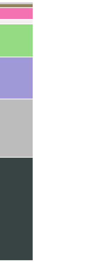
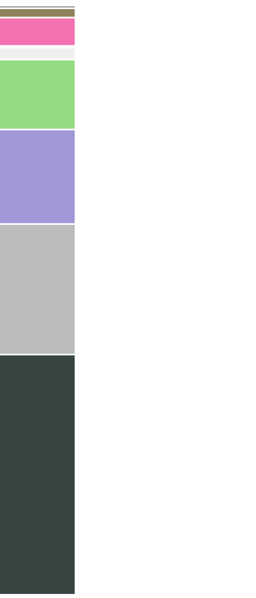
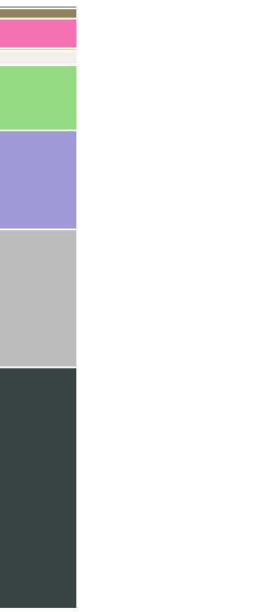
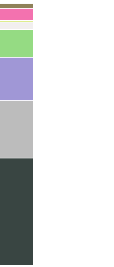
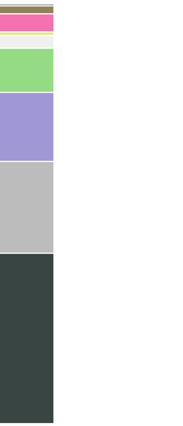
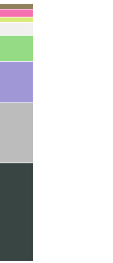
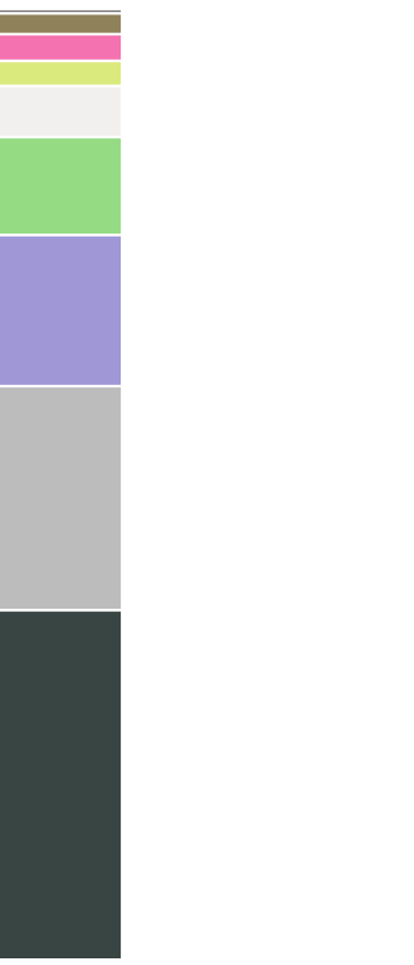
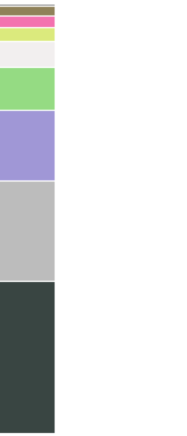
the electricity makeup in our dataset consists of 9 different sources.
let's take a look at how they've evolved over the years.


2010
global electricity production share of renewables
~19.4%
solar is nowhere to be seen with ~0.15% contribution, and the price per megawatt of electricity by source* being one of the highest at $378/MWh.
2011
global electricity production share of renewables
~19.8%
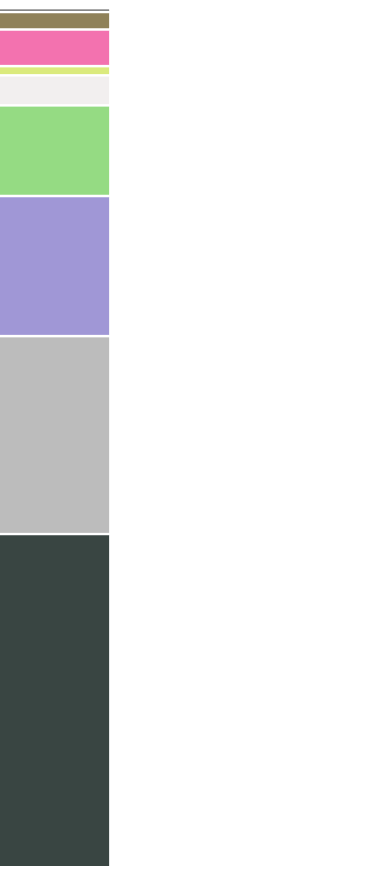
2012
global electricity production share of renewables
~20.6%
we can start to see a sliver of solar electricity contribute to ~0.43% of the mix.
2013
global electricity production share of renewables
~21.5%
2014
global electricity production share of renewables
~22.0%
2015
global electricity production share of renewables
~22.7%
2016
global electricity production share of renewables
~23.5%
2017
global electricity production share of renewables
~24.4%
2018
global electricity production share of renewables
~25.0%
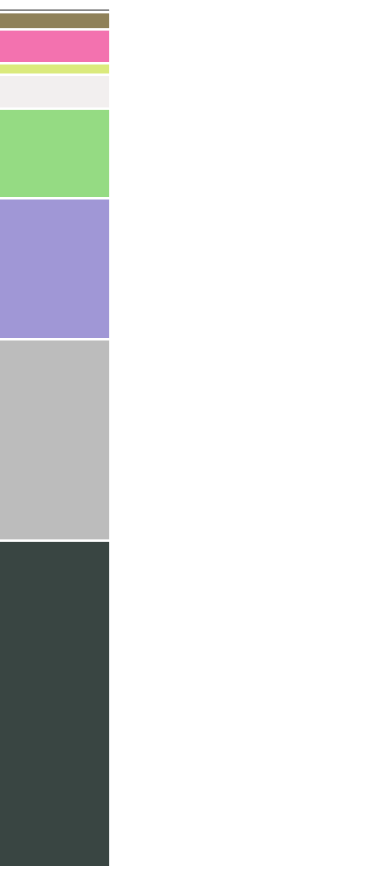
2019
global electricity production share of renewables
~26.0%
solar now contributes to ~2.66% of the mix, and the price per megawatt of electricity by source* has dropped to one of the lowest at $68/MWh.
2021
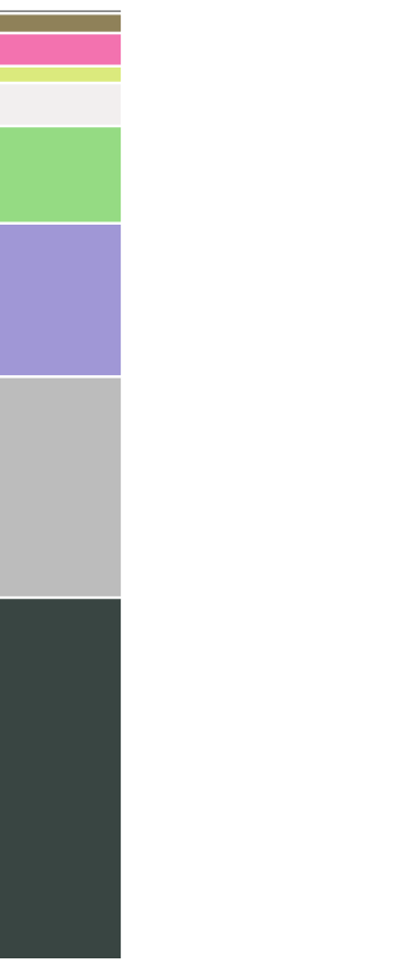
2020
global electricity production share of renewables
~27.9%
While the global trend towards a more sustainable electric grid is encouraging, it's important to also consider the progress of individual countries
Each nation has its own unique challenges and opportunities when it comes to transitioning to a cleaner energy mix.
the following section shows the share of electricity production by source; feel free to select your region and see how it compares against others over time.
I would like to encourage you to Explore the resources provided to gain a deeper understanding of the topic and continue the conversation on transitioning towards a sustainable energy future.